Thursday, 3 December 2015

SWEDING: Tyrannosaur practice exercise

I've blogged on this before, but I'll bring together all you need into this post...

YOUR TASK: Take the archetypal Warp Films production Tyrannosaur, with its deeply flawed working class protagonist, disturbing social realism, low budget (mostly financed through grants and UK TV pre-sale of rights), lack of stars, critical acclaim (including TIFF) and US distribution issues contributing to a low box office ... and flip it into an equally archetypal Working Title production!

WT have produced well over 100 movies, so have worked in every genre and presented many depictions of Britain ... but you are focusing on an exaggerated snapshot of how the nature of this film, its characters, the setting/mise-en-scene, perhaps even the music, would change if this was made by them.

Your Tyrannosir swede will be rather silly, but will include versions of key scenes from the opening of the actual film. You will blog your screenplay, storyboards and any other preparation, and clearly outline how your ideas reflect your knowledge of both companies - using specific examples as illustration where possible (just as you would in the exam: EAA, with EX, and T).

Sweding is a concept that emerged from Michel Gondry's comedy Be Kind Rewind, starring Jack Black. Black's character enters a video store(!) and the magnetism he carries wipes out all of the video tapes ... so, he shoots new, no-budget versions. As part of the film's promotional campaign the audience were invited to submit their own daft 'sweded' films through a website, and the concept continues to inspire some very clever (and some not so!) UGC.

BE KIND REWIND TRAILER:


Monday, 16 November 2015

Reviewing and re-planning a bad shoot

The good news about a bad, unproductive shoot is that you can learn a lot from it, and be much better prepared the next time you're on a shoot! The same applies to films incidentally: a bad film will have you mentally working out what the filmmakers should have done!

I set out some pointers in this post, which you can use to help you with this review.

Your task is to discuss and agree on a list of things you will improve on before your next shoot - what didn't you do; what would have made this shoot more productive? Preparation is generally a key failing; a substantial amount of marks for coursework Research and Planning are linked to this for a reason! Formally storyboarding, scripting (screenplay) and preparing call sheets (shot lists) are all coursework requirements.

This is not an invitation to start finger-pointing; if you start that your review will be every bit as unproductive as the shoot itself!

For this discussion to work, you need to adhere to the principle of one voice at a time, and should consider appointing someone to lead and guide the conversation, including selecting who is speaking and deciding when to move on to another point.

----------------------------
Once you've all agreed on a clear, specific list of points which you can then each blog on, begin the process of re-planning - you will have a second opportunity at this on Wednesday 25th, periods 1+2.

Think clearly about the specific roles involved, and ensure that for each segment/location these have been specifically assigned. It is useful practice for you to share and rotate these. Consider how these roles might best combine: should the camera operators passively await instruction from a director for instance?

The workload must be fairly shared.

The footage from the original shoot is saved; we can discuss whether or not to edit this.

IF you manage to get this completed before I'm back then start working on further coursework research: each of you looking at multiple genre film openings; preparing vodcasts on locations, cast/characters, costume, props + mise-en-scene generally; genre signifiers and intertextuality; the idea + narrative; titles; soundtrack.

Saturday, 24 October 2015

SHOOTS ten tips for a successful shoot

I'm sure there are plentiful more learned guides out there - and I'd always encourage reading video/film-makers' books (Alex Cox is very readable on his low-budget Indie shoots) - but these are ten simple bits of advice based on years of observing student filming, especially the common disasters that happen...

Friday, 9 October 2015

Researching film titles design and fonts

Part of Molly's research from 2015, looking at several films in this post.
USE THE titles TAG FOR MORE POSTS!

Highlighted every year without fail by examiners as a weakness across the national entry, film titles need to be closely scrutinised before you make decisions on how to design yours, thinking about ...
THE RAW NUMBERS:

  • how many titles do you expect to see?
  • provide counter-examples with very few or no opening titles
  • what total running time is typical?
  • again, note exceptions


THE SPECIFIC WORDING + ORDER:
Look carefully at the precise wording for each of these:

  • companies (presents, a ... film/production, in association with...)
  • director (auteur theory reflected in TWO credits - a ... film, directed by; where do these come in the order?)
  • actors (introducing, starring, featuring, co-starring ...)
  • technical roles (you need to be clear on which you will include; look for specifics eg director of photography or cinematography by?)


THE DESIGN
Look at use of these aspects and how they are used to distinguish/denote relative importance:

  • (sans-)serif (consider to what degree titles connote genre here)
  • size (names usually bigger than role, by etc; bigger stars bigger title?)
  • colour
  • case (UPPER, lower, Sentence case, maybe mixed)


FX, ANIMATION
Some titles are simply static, but often there's some form of movement...

  • animation/movement/FX?
  • transitions or straight cuts? fade to/-in from black?
  • intertitles? (over black screen)


  • what to include (and exclude),
  • the timing (continuous with identical gaps? from the start or later in the opening? when do they end?),
  • the order titles appear in,
  • font (serif or sans-serif? upper/lower case, a mix?),
  • size and any variation of this (within titles and for different roles),
  • the specific wording,
  • the (auteur) convention around crediting the director twice, the wording and order of this,
  • checking if distributor and production companies receive different wording,
  • looking for variation in the presentation of stars, co-stars, new actors (introducing...),
  • the specific roles that are credited (as opposed to dumped into the end titles),
  • colour,
  • animation,
  • transitions (fade in/out? wipe?),
  • other design features (e.g. underline, graphic containers)
  • the main (film) title (is it differentiated?)

... there is a huge amount to think about (and later to explain and justify your choices)!!!

IN THIS POST: Links and video clips to help you with researching and getting ideas for film titles design. I'll blog separately on researching fonts and looking for a specific downloadable font. First, a vodcast - you'll need to create similar video guides...


FCPX plug-ins

Budget limitations may mean you'll have to pay for it yourself, but do be aware there are many great plug-ins out there for Final Cut Pro X (and most major video editing suites).

We looked recently at a very specific example, as students looked to emulate aspects of some depeche Mode videos they particularly admired:
FINAL CUT PRO X CAMERA EMULATOR PLUGINAs raised when looking at these, you can emulate super-8 and 16mm (etc) cameras by purchasing FCPX plugins (this one is $50 - you may need to buy it yourself and carry edited clips from your own Mac to a school one).
[copied across from a post on Depeche Mode and the French New Wave style]

Film Openings: What to blog on

I have covered this in much greater detail, including many examples, here. This is an abbreviated version where I've picked out a dozen key factors. There are of course others you could think about, and these categories considerably overlap ... but I hope this will help to really narrow down what to look for.

DENOTED DOZEN: KEY FEATURES OF FILM OPENINGS TO ANALYSE

1: IDENTS - how many; how long are these; what company type/s are featured: distributor, production?

2: 1ST SHOT - Discussing the semiotics, including Detailed denotation: what exposition is provided/withheld? Is it faded in? How long is the 1st take? Static or moving camera?
  • Don't twist your analysis to fit the genre, it doesn't always match the genre so neatly!
  • Consider exposition, narrative enigma, (non-)diegetic sound, anchorage/polysemy - sound is relevant as well as mise-en-scene.
  • Is the camera static or moving (does the shot/framing change?).
  • What does this shot lead into?
  • Looking ahead, you could apply Todorov's narrative model (equilibrium).

Wednesday, 7 October 2015

TASK: Starting to consider film opening conventions

Your coursework brief is to create the opening 2 mins of a new feature film including titles. Before embarking on any production in Media Studies, you must always thoroughly research and analyse the prevailing codes and conventions (not 'rules') of a given format, then look more closely at those of a specific (sub-)genre once you've settled on a firm production idea.

For the tasks below, you will consider the assessment criteria and how this research fits in, as well as what to consider, before starting to make detailed notes and blog on aspects of one example of a film opening. You will present your findings and take notes on others' findings before summing up your view of what the common conventions are in a series of short vodcasts.

TASK 1: [post] The role of researching conventions in our coursework
Using either your printed copy or an online version, look through the assessment criteria for all three marked sections of your coursework and note in this post any and all elements of this that are linked to researching the conventions of film openings (and film/genre conventions more broadly). Include any relevant Evaluation questions in your list.

TASK 2: [post] What I should look for when blogging on film openings?
We will discuss this in a class, after which you should consolidate your list of things to consider by carefully reading this post.

Ask if unclear about any terms.

TASK 3: [multiple posts] Titles, 1st shot, length of opening
You will each view and analyse ONE film opening, feeding individual findings, including typed detail and plentiful screenshots, into the following posts:

Sunday, 27 September 2015

2015 Blogs: Posts You Should Have So Far

Your blogs should be starting to build up a picture of your grasp of media language, semiotics and how the film industry works. You will have followed closely the very specific instructions on blog settings, and will have (perhaps with different titles) the following posts. Where I've put [Film Title] you should type the film title(!); I use the abbreviation WT for Working Title - you can use either.

When you receive blog comments please make changes within two days; if you're unsure or need help/clarification, please ask! You will be writing up a log of improvements across the year.

FORMATTING + PRESENTATION:
You can find MUCH more detail (and illustrations) in this post.
The post title should be short, pithy but clear. This will appear as large bold text, effectively your heading.

Provide clear sub-headings where relevant: adjust size, font, colour, bold.

Don't use underline or colour highlight.

Don't use Courier font.

Remember to highlight terminology with bold + pink.

Add relevant tags ('labels') to your posts.

Round box office up/down to a useful, memorisable figure, using k or m not 000 or 000,000.

Denote quotes of 2+ lines by changing font to Trebuchet, colour purple and clicking speech marks icon to indent. Provide the source; describe in a word or two, make bold - [] are advisable, e.g.: [BritCinema blog post]
More guidance on providing sources, and quoting, here.
Provide links as often as possible: if you're blogging on a film, making the film title (the first time you use it in a post) into an IMDB link is useful. If discussing box office, the boxofficemojo.com or the numbers.com link are useful. If quoting an article [source] or [article] are always expected. Always make it clear where your information comes from, even if its not a direct quote.
TIP: When adding images, videos or other embedded material, hit return, type ..., and go back to blank line before pasting in embed code. That will prevent later problems with adding more text. Before formatting a sub-heading or quote add a return/blank line with ... before highlighting text to format. That avoids having to re-format for 'normal' text. Same point for terminology: finish the sentence then format the terminology. If you've forgotten this, just copy some 'normal' text, paste it and type over it.
Always give the director, year of release + budget of a film you're analysing. This applies to essays too (budget isn't vital here), eg:
This is England (Meadows, 2006) sparked Warp's first franchise and demonstrates convergence with TV... [I've set this out as I do for quotes]

YOUR BLOG SHOULD HAVE THESE POSTS...

Sunday, 13 September 2015

SOFTWARE Editing with Pinnacle Studio aka Avid

Okay, so if you have the option you'd opt for Final Cut Pro X and editing on a Mac ...

If not, there are many options out there. Pinnacle Studio may not be as highly rated as Final Cut or Premiere, but it is a very powerful package, and in a different league to basic editors such as iMovie.

I've just started with it myself, and find it straightforward to use, but if you're new to video editing, or haven't moved beyond iMovie (or the even more basic Windows Movie Maker), it will take you a while to get used to it.

The best way to do that? Use it. Not to 'practice', but simply to edit video - practice film exercises, or vodcasts to better present your research. You could also spend time with it for non-Media or even non-school work. The more time you spend using it the more familiar it will become (and this will prepare you for other video editors; they may look different but there are common elements across most).

Pinnacle was bought up first by Avid then Corel; it is effectively the offspring of three big name software companies.

VIDEO CAN BE SLOW...
Video is best to get you started, but once you start looking for more specific guides and instructions do consider looking for text-based step-by-step guides too, which can be much quicker to use, and without the potentially annoying quirkiness of some of the presenters.

THE BEST THINGS IN LIFE AREN'T FREE?
Unlike Final Cut, I can't see any paid-for online courses (indeed, you can gain Apple certificates in Final Cut!) on the likes of Lynda.com for Pinnacle Studio. However, there is a 2013 guide book by Jeff Naylor, listed at £30 on Amazon UK. This offers a series of tutorials as well as a reference guide.
This might be a useful investment
FREE ONLINE TUTORIALS

There aren't as many online guides as there are for the big two, Final Cut and Premiere, but there are enough to get you going, and to enable you to master more advanced techniques once you're familiar with the basics of importing, organising and editing.

Friday, 11 September 2015

The Art of the Vodcast

I have previously burbled on at greater length about vodcasts - here. This post will be less detailed.

In the context of coursework, podcasts which summarise research are great ... as you can re-edit these for your Evaluation, including comparison with what you actually produced/did.

A vodcast is a podcast with video. It is likely to include your voice, though you can use titles to the same effect.
A mini GUIDE TO GOOD VODCASTING PRACTICE: brief, pithy, well illustrated, creative, expressive, analysis, terminology, concepts, opinion, titles, chapters, top ten, short clips, fair usage copyright law, mix audio levels, limit face time, branded, ident, channel watermark, target audience, tags, YouTube, links lists...

It will be quite brief. About 2 minutes is good; 5 minutes is starting to push it ... and don't go beyond 10 minutes. If you can't fit all your content into that time limit, think about how to split it up into themed chapters.

Brand your vodcasts, as I do. Once you've created a basic 'opening title' sequence for one, you can copy/paste the sequence into any future vodcast and simply edit the titles. I also recently started adding a watermark, in the style of the company or channel logos you see on TV, asserting my brand but also ensuring my work can't be ripped off!
I've created quite a few vodcasts, and will be adding more - a playlist is embedded below

Tuesday, 1 September 2015

WEBSITES Using Wix to build your band website

Not such an issue for film openings, but cross-posting this guide on creating a music act website...

IN THIS POST: Guides and how-to's for using Wix to build your own band website, incorporating multiple top-linked pages and deep social media integration, plus e-commerce for merchandise and music sales (even if not ultimately connected to a card/payment account), search engine hits (SEO) and more specific techniques through YouTube guides. 
To view a range of student websites following the music promo package brief, see this post.
First up, perhaps uniquely, an advert...


WHY WIX?
You may not have heard of Wix before now (I hadn't until it was recently recommended to me), but it is a high profile, internationally popular website build option (they claim its used in 180 countries), reflected in the range of languages how-to YouTube videos come in. It fares well when compared to rivals. It operates a freemium model - you can access most things for free, but can pay for more options.
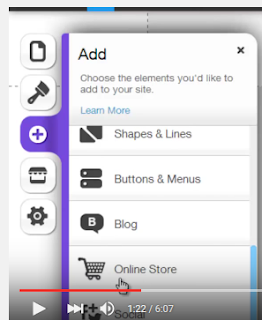
Wix manages to make intricate, fully-featured website design easy and intuitive - and there are plentiful online guides...

WordPress is the dominant player in the online website-builder market (DreamWeaver remains the dominant software option), but Wix boasts a vastly superior ease-of-use; there is a much steeper learning curve with WordPress. Other rivals such as Weebly are not only more limited but also charge for options bundled for free with Wix. According to this site, Wix is the third most-used online website builder.

Wix is largely controlled via drag and drop, with the ability to go into menus to edit site layouts - you should find it a highly user-friendly website builder... [You can read more basics at the Wix Wiki]
Wix.com's 90-second intro to working with Wix


If you do go on to look to monetise any of your work, a former student (Amber) who got a job handling e-commerce operations for a an online retailer on the back of her Media work, not least the blog, tells me they found the e-commerce provision in Wix quite problematic, and had to get onto the helpline frequently. How typical or not that is I have no idea!

BEFORE YOU GET TO WIX...
Read the guide on the steps involved in researching and planning your website.

YOUTUBE GUIDES
When I approach new software or ICT tools, YouTube is generally my first port of call. In time I will seek to create one or more vodcasts myself. You can use Wix's Help function and general online search for alternatives to video; eg this is Wix's step through guide to creating your own landing page (and the Wix site has a search box of course).

Wix provide this '10 must-see Wix techniques for Newbies' page which would be a good starting point too; it appears to initially load in Spanish (but then auto-translate into English).

EG1 - ANIMATED GALLERIES; EDIT COLOUR SCHEME; CREATE ICON
For now, take this short (3min) example. Its a run-through of just 5 tips, but shows you clearly how to do so - I'd skip to tips 3, 4 and 5 (animated galleries; changing the colour scheme; creating an icon for your website which can be embedded - just as the Twitter etc icons are - on other sites, including your social media) from 1:03 in:


EG2 - FULL RUN THROUGH OF SETTING UP, EDITING A WIX SITE
Here's a lengthier (17:33) overview, taking you through the entire process from picking a template to customising and adding your own content. I'd skip to 1:14.


EG3 - FULL RUN THROUGH OF SETTING UP, EDITING A WIX SITE
One more lengthy video guiding you through the full process; you can easily find more should you wish to(?!).
This one (25mins) is aimed at teachers, but again runs you through the process and various specific techniques:


It may be worth watching one or more full runthroughs to get a preview of some of the techniques involved, and perhaps some reassurance for the newbies that this is very manageable, but these videos aren't so useful once you're sat trying to figure out specific techniques. For that you'd want to find more specific guides - and perhaps look at web pages as well as videos, according to your own preference (video can be a slow way of getting precise information). Some examples follow, but I've gathered more into a Playlist, and will shortly point you to an official Wix playlist which you could use...

EG4 - ADDING MEMBER SIGNUP/LOGIN BUTTONS
A good example of the strengths and weaknesses of video tutorial; it starts with a minute of waffle (skip to 1:09 to avoid it), but is clear and easy to follow.


EG5 - APPS + ADDING A SEARCH FUNCTION
Whilst not entirely thrilled with his style, I clicked through to the 'ComputerMDofGilbert' channel and searched for Wix. This is one of ... lots of hits that came up; The Doc has put together guides on many of the topics you might want to figure out in time. Once again the first half is waffle (the final minute too!), but skip to 2:02 and you've got a good, clear, concise (really just 90 seconds!) guide thats very easy to follow.

In this example, you need to access an app, just as you might with your smartphone. These mostly follow a freemium model; the free version of the search tool here is limited to just 30 searches per month, but if you're concerned an examiner might think something is broken you can always have blogged a brief demonstration of it working (or pay for the app upgrade).


EG6 - E-COMMERCE
Business users appear to be the predominant Wix user, and many of the online guides are focussed on e-commerce. Much of the point of any contemporary music act website will be to raise revenue, through merchandise at least as much as through music (and Miley Cyrus was hardly the first to decide that giving away her music could still be a profitable model).

There's a complete start-to-finish walk through centred on e-commerce (the link skips a minute of waffle); a 14min 'Blogtrepreneur' guide; a feature promoting a specific Wix e-commerce app (Shopify); the Doc has done a shorter guide, which I've embedded below - as usual, there's waffle which you can skip by going to 1:08. Later, I'll highlight Wix's own video guides.

As I noted above, one former student who got work while still on the Media course through the quality of her blog experienced difficulties with real-world use of Wix's e-commerce tools, but how typical that anecdotal experience is I don't know.

EG7: ADDING SEO (search engine optimisation)
There are lots of videos on this too, a useful point for you to consider as part of your engagement with audience and use of technology. This example is from 'Website Builders Critic', a 6 min video - there's an exhaustive 40 minute webinar too!


A fragment of a 37-video Wix playlist, generally short (1-2mins) + focussed!

WIX'S PLAYLISTS OF VIDEO GUIDES
Wix themselves have produced a wide range of highly focussed video tutorials (in addition to the site's Help function). Have a browse by clicking through to the YouTube page on this video, part of a playlist of 37 videos, generally 1-2 minutes long and mostly highly specific. This is their guide on adding a shop to your site.


FOUR USEFUL LINKS FOR WIX
Simple 'Wix' search on YouTube.
ComputerMDofGilbert's Wix guides.
The Wix.com playlist.
10 Top Techniques For Newbies (wix.com).
...

Sunday, 30 August 2015

ASSESSMENT EXAMPLES Selected by exam board

This dates back to 2013, but the assessment criteria and levels remain the same: examples of productions in several grade boundaries from (almost) full marks to E grades. You can of course access plenty of past IGS productions, several of which achieved full marks (including on Research + Planning and Evaluations - several 100% marks have been recorded), but there is a range - click here for playlists and a blog listing hyperlinked student blogs by year with brief descriptions.

Click here to access the OCR weebly which contains the post. Note that the weebly doesn't provide an archive list of posts, one of the key reasons we use blogger (and something the exam board specifically state in annual reports must be included!).
The mark/60 is given underneath each embedded AS film opening

Wednesday, 13 May 2015

TECH TIP: Using ViewSync to compare cuts

Thanks to Conal Walsh for this, I'd never heard of ViewSync, a nifty website, designed with gamers in mind, which enables  you to view 2 or more cuts side by side. A nice example of convergence - the sort of high-tech gadgetry that you might associate with the likes of Formula One is now in the hands of everyone. When you're trying to pinpoint the changes made step by step, and also as a tool for some targeted audience feedback (generate different clips of the same short sequence with different editing styles for example), this is a great option.
Conal's ViewSync for nine iterations of the Bad Romance video

Friday, 17 April 2015

TECH TIP: Rotating pdf files

Just had to figure this out so thought I'd share it. You need the full (Pro) Acrobat to save rotated files, but there is a free (limit 10MB) site that allows you do this and save the file...